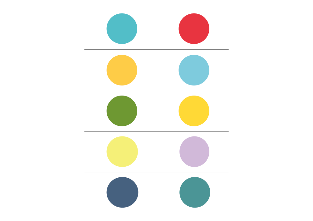
The two main colours in the colour schemes for the four different course assignments as well as for the project exam.
WORK
COURSE ASSIGNMENT 05
In the course Screen Based Design 1, Part 1, with the theme ‘HTML and CSS’.
COURSE ASSIGMENT 06
In the course Photography 2, with the theme ‘Studio Shooting’.
COURSE ASSIGNMENT 07
In the course Screen Based Design 1, Part 2, with the theme ‘Information Design’.
COURSE ASSIGMENT 08
In the course Graphic Design 2, with the theme ‘Branding and Packaging’.
PROJECT EXAM 01
Creating a website.
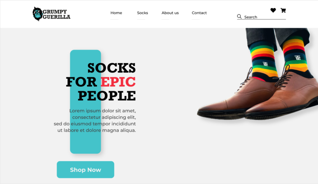
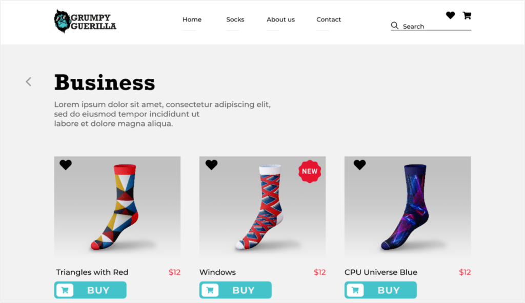
COURSE ASSIGNMENT 05
This assignment was in the course Screen Based Design 1, Part 1, with the theme ‘HTML and CSS’. We were given the task to create a prototype for the fictious brand Grumpy Guerilla. I chose to create the prototype using Adobe XD. We got the brand elements handed out, like the colour scheme, logo and fonts. We also got a discription of who the brand are and their brand identity. The company sells colourful, bold, unique and fun socks to everyone who want to feel good at work, when socializing and working out. Grumpy Guerilla wanted a simple website that represents their brand to reach out and showcase its products to potential customers. The requirements for the website prototype was that it should be interactive and contain four pages; ’Home’, ’Socks’, ’About Us’ and ’Contact’.
In this assignment we were supposed to show what we have learned about accessibility, information architecture, wireframing and prototyping. I was focused on sizes and contrast, creating a flow in the navigation and creating a good prototype.
Click the button below to get to the Adobe XD Prototype file.
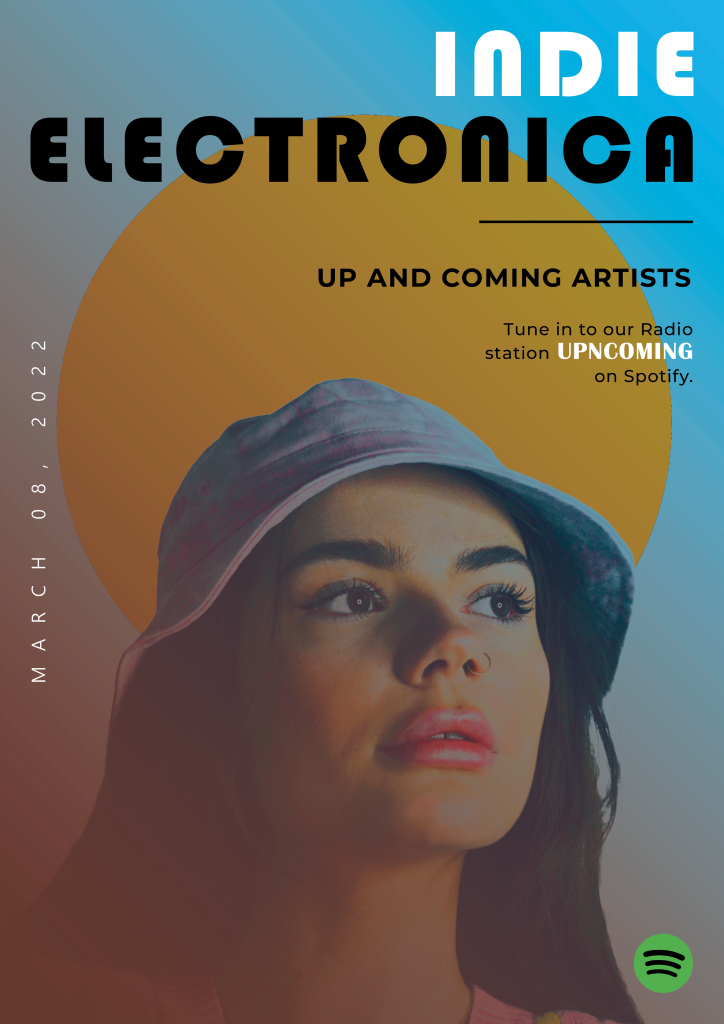
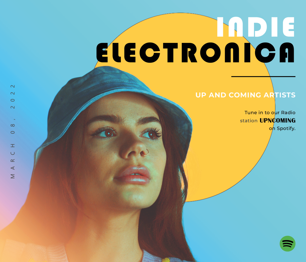
This is the assignment in the course Photography 2, with the theme ‘Studio Shooting’. We were given the task to create one online and one print advertisement for a radio station where we could choose one radio station genre out of three categories. I chose the radio station: ”Music: Independent ”up and coming” artists operating in the genre indie electronica”.
I wanted a cool, edgy, modern but also retro look for the pictures and advertisement. I chose to take the portrait photos up close of the model, to capture the eyes that ”are looking into the sun”. I chose a mix of retro and contemporary fonts to reinforce this mix of styles. I used Adobe Photoshop to edit the photograph, also for the background. Then I used Adobe InDesign for creating the layout for the posters.
Print version.
Online version.
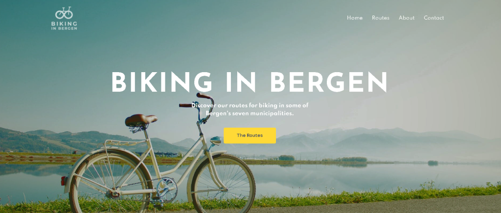
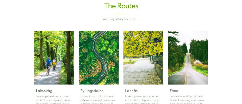
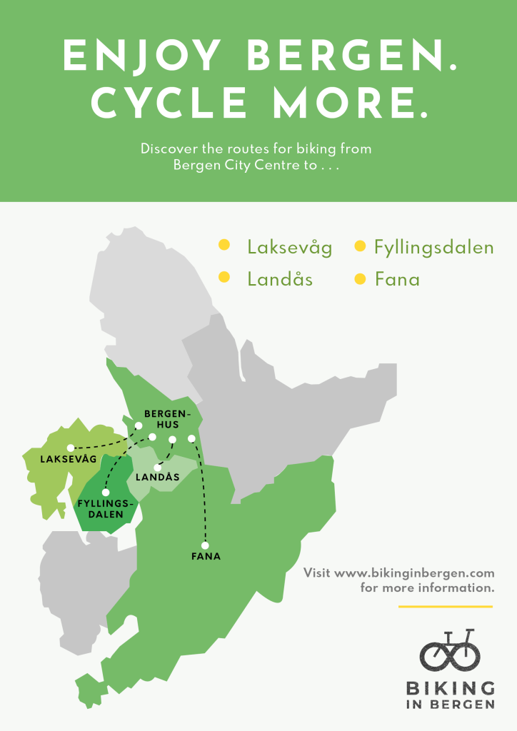
COURSE ASSIGNMENT 07
The seventh assignment was in the course Screen Based Design 1, Part 2, with the theme ‘Information Design’. We were given the task to create an A3 poster together with a four-paged website for the fictious brand ”Biking in Bergen”. The website has to consist of these four pages;
– Home – Routes – About – Contact
It was important that there is brand consistency within the design of both the poster and the website. I decided to create a brand identity for Biking in Bergen to be a brand that has focus on simple, inspirational design that motivates the users, and to have welcoming and warm colours, images and design elements.
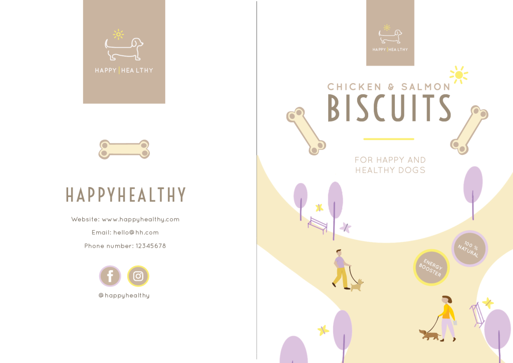
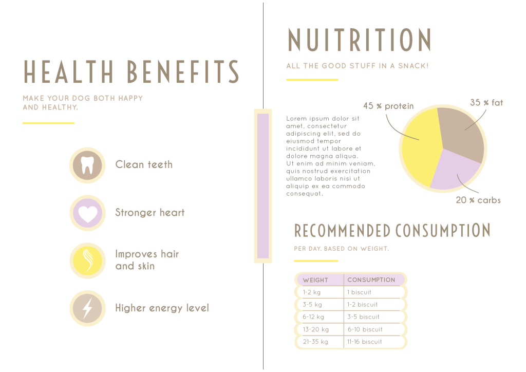
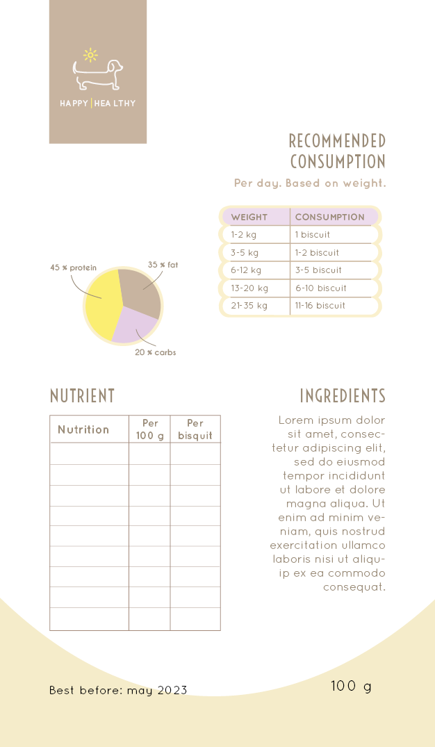
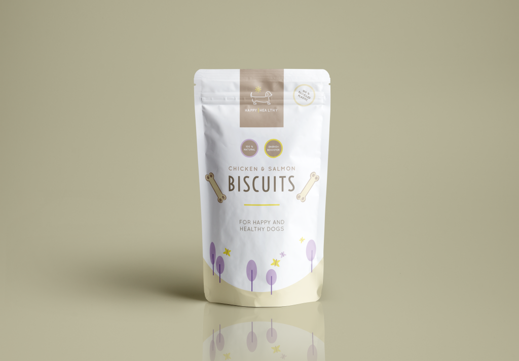
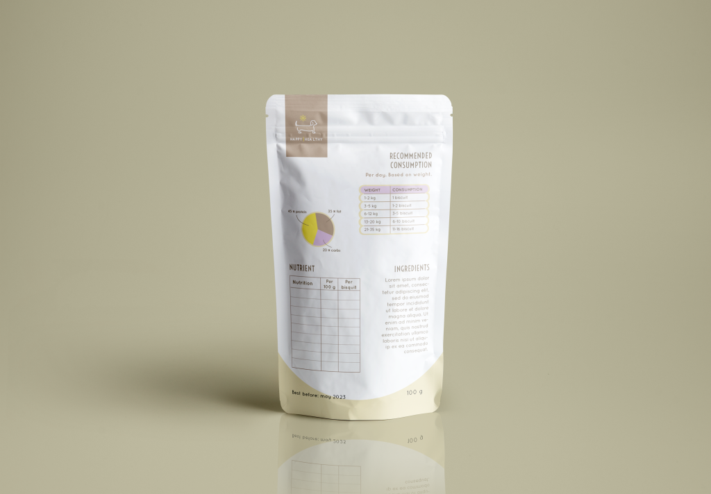
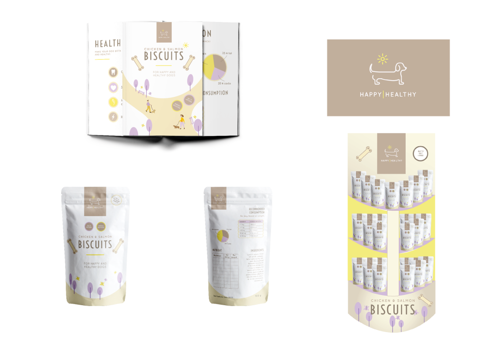
This assigment was in the course Graphic Design 2, with the theme ‘Branding and Packaging’. We were given the task to create a brand identity for a dog food brand including a logo, infographics, brochure, packaging and point of sale.
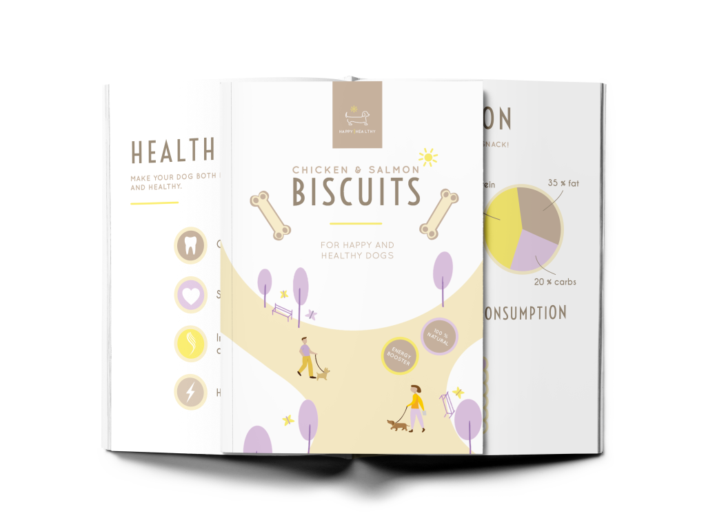
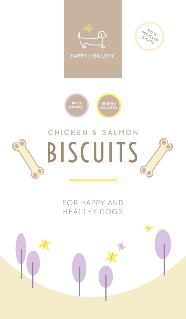
I chose to call the brand ”Happy Healthy” and the product is dog biscuits. The logo consist of a brand mark and the brand name, the brochure is four paged in A5 format containing of the infographics, the packaging is a plastic pouch containing of some of the infographics, and the point of sale contains of three shelves having the products on it as well as some infographics, the logo, illustrations and a call-to-action symbol.
The logo.
The brochure in flat design.
Mockup of the brochure.
Front and back of the packaging in flat design.
Mockup of the packaging, front and back.
The Point of Sale.
All products together.
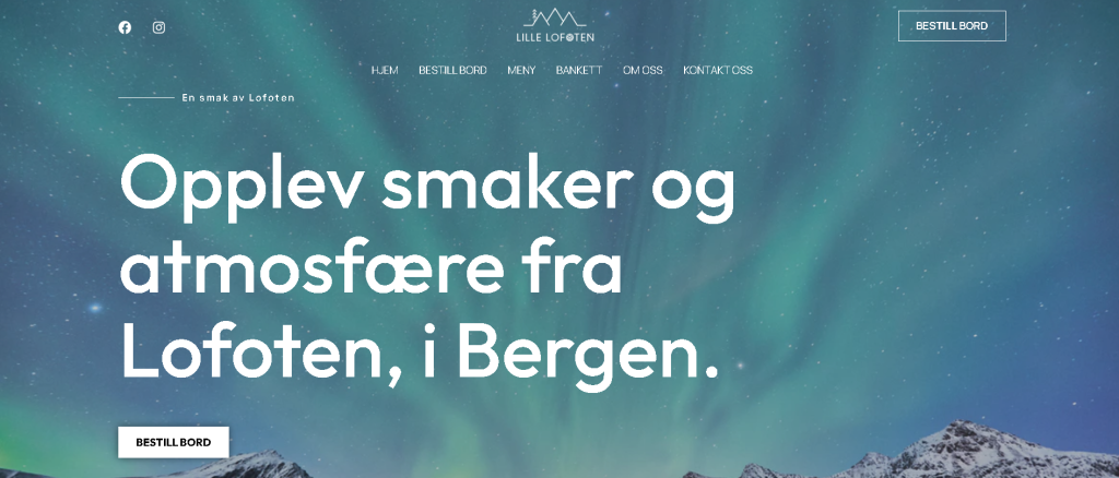
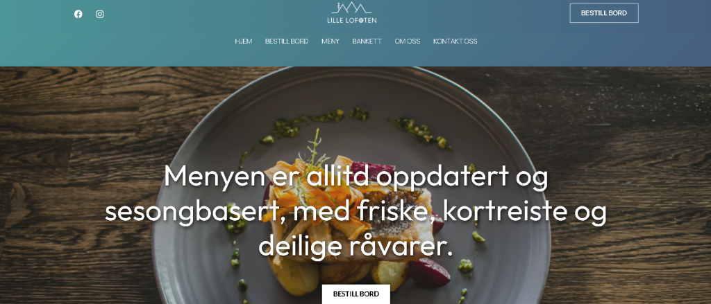
PROJECT EXAM 01
For the project exam, we were given the task to create a website for a real or fictious client. My client is real, and has an up-and-coming restaurant which is called Lille Lofoten. They are at the very start of the idea development, so the brand is totally new and fresh, without any visuals or brand identity. The website consist of these six pages;
– Hjem (home) – Bestill bord (order a table) – Meny (menu) – Bankett (banquet) – Om oss (about us) – Kontakt oss (contact us)
The style of Lille Lofoten should be the modern meets the traditional, having graphic design elements that are typical for Nothern Norway and giving the viewer a feeling of a place that is both trendy, homey, cosy and contemporary.
I used one.com as hosting for the website, and WordPress to create the website. The theme I used is called ‘Astra’. I used Adobe XD to create the prototype.